This is an old revision of the document!
Table of Contents
T18: Plotting a TTP diagram
This tutorial was tested on
MatCalc version 6.02 rel 1.003
license: free
database: mc_fe.tdb; mc_fe.ddb
Complimentary files
Click here to view the script for this tutorial
Contents:
- Calculating a TTP diagram for isothermal treatments
- Calculating a TTP diagram for continuous cooling
- Plotting the diagram
- Display options: absolute, relative or relative to maximum phase fraction
A time-temperature-precipitation diagram is a plot consisting of contours characterising the extent of a precipitation reaction on axes of temperature versus time. In this tutorial, a TTP diagram will be calculated for the precipitation of NbC in the austenite single-phase region.
Setting up the system
Create a workspace with the elements Fe, Nb and C and the phases BCC_A2 and FCC_A1. Enter the composition 0.1 wt.% C, 0.7 wt.% Nb.
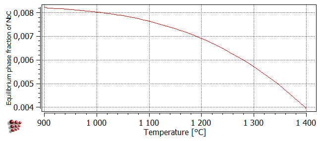
Firstly, it is necessary to determine the extent of the austenite single-phase region in which the TTP diagram is to be calculated. To do this, first calculate an equilibrium at 1000°C and then search for the BCC_A2 phase boundary (referring to Tutorial 7 if necessary). This gives a temperature of 905.25°C for the zero-phase-fraction boundary of BCC_A2. This is the upper boundary of the low-temperature 'alpha' form of ferrite. Next, calculate another equilibrium at 1200°C and repeat the procedure. This time, the temperature value found is 1397.69°C, which is the lower boundary of the high-temperature 'delta'-ferrite. Between these two limits, the only stable matrix phase is austenite (FCC_A1). Perform a stepped equilibrium calculation between 900°C and 1400°C with 10°C step and plot the phase fraction of FCC_A1#01 phase depending on the temperature.
Create a precipitation domain named 'austenite' with the phase FCC_A1 as its matrix, and a precipitate phase FCC_A1#01_P0. Its precipitation sites should be dislocations. Leave all the other settings at their default values. Read in the mobility data.
TTP diagrams for isothermal heat treatments
Calculations of phase fraction for isothermal treatments
The plot below, obtained using a stepped equilibrium calculation, shows the equilibrium phase fraction of NbC between 900 and 1400°C:
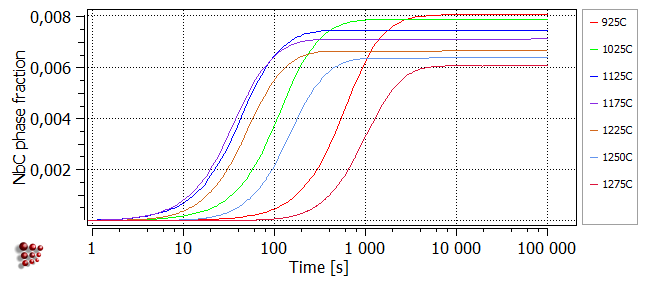
The plot below illustrates the origin of the typical C-shaped curves of TTP plots. It was obtained using 'Calc > Precipitation kinetics' to simulate an isothermal heat treatment at 925°C, plotting the series F$FCC_A1#01_P0 on a logarithmic x-axis, then duplicating and locking this series before making further calculations in the same way at a selection of other temperatures. At each value of temperature, the phase fraction of NbC increases with time before reaching a plateau when the equilibrium phase fraction of NbC at that temperature is attained. It can be seen that, between 1100 and 1200°C, the rate of reaction first increases (characterised by a shift of the curve towards the left), goes through a maximum, then decreases again. TTP diagrams plot the time taken to reach a particular point in a reaction at different temperature values. It can be seen from the plot below that if, for example, the time taken to reach 90% of the plateau value were plotted for each temperature on axes of temperature versus time, the resulting curve would be C-shaped. The TTP diagram calculation function of MatCalc allows automatic calculation of curves of this type.
Automatic calculation of TTP diagrams
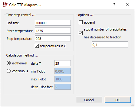
Open 'Calc > TTP-diagram' and enter '1375' as the start temperature and '925' as the stop temperature. The end time should be sufficient for the phase fraction to reach a plateau at all temperatures under consideration (This can be verified by creating an XY-plot of F$FCC_A1#01_P0 versus time and monitoring this during the TTP diagram calculation). In this case, 1e5 seconds are good enough.
In the 'Calculation method' area, select 'isothermal' and enter a value of 25 for 'delta T'. Calculations will now be performed every 25 degrees between 1375 and 925°C.
Note: The calculation in the whole range may take more than 30 minutes (depending on your PC capacity). In case you would not spend so much time on this tutorial constrain the temperature range (e.g. 925°C - 1225°C)
Plotting the results
When the calculation has finished, create a new window of type '(p6) Plot: TTP-diagram'. In the 'options' window, expand the 'plots' section and right-click in the area under 'plot#0' to show the context menu. Select 'new series' and choose 'ttp-curve' from the sub-menu on the right. Next, it is necessary to decide on the type of TTP contours required. The three options are:
- Absolute: the contours correspond to different values of the phase fraction F$FCC_A1#01_P0.
- Relative: a contour with a value of 'x' for a particular temperature denotes the time at which the ratio of F$FCC_A1#01_P0 to its maximum value at that temperature is equal to 'x'. The maximum values of F$FCC_A1#01_P0 are approximately equal to the equilibrium phase fractions F$FCC_A1#01 shown above.
- Relative max f: in this case, contour values represent ratios of F$FCC_A1#01_P0 to its maximum value overall. These contours have a similar form to the 'absolute' contours, but different numerical values.
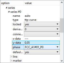
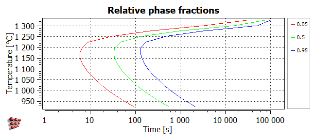
Select 'relative' from the 'refer to f' drop-box at the top of the 'options' window. Then expand the 'series' section of 'options', which should look as shown in the image below. Select the phase FCC_A1#01_P0 from the 'phase' drop-box and enter '0.05' into the 'y-data' line.
Add two more series to show the contours for ratios of 0.5 and 0.95 on the same diagram. The resulting diagram should look like this:
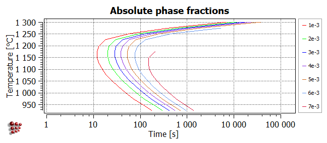
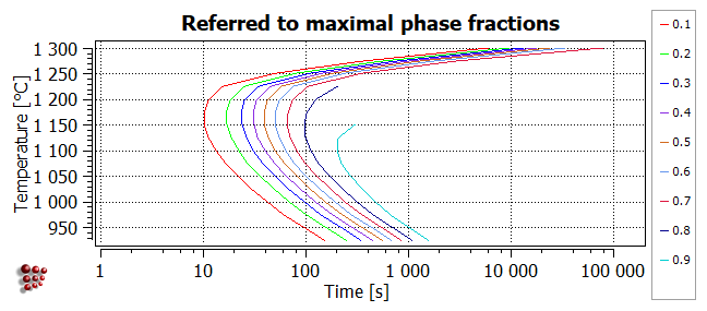
The following two plots are examples of the other types of TTP diagram. (TIP - to create more than one type of TTP diagram in the same plot window, lock all the series in the first diagram, then change the diagram type in the 'refer to f' drop-box to plot the next diagram.)
Absolute
In the plot below, the contours correspond to different values of the phase fraction F$FCC_A1#01_P0. Note that the higher values are only attained at lower temperatures, because the equilibrium value of F$FCC_A1#01 decreases with increasing temperature. The maximum value of F$FCC_A1#01_P0 is around 7.8e-3.
Relative max f
This diagram has a similar appearance to the 'absolute' diagram above, but the contours now represent different ratios of F$FCC_A1#01_P0 to its maximum value.
Consecutive articles
Go to MatCalc tutorial index.
